Hi, I’m Andrei Bilan, a passionate Art Director and UI/UX Designer with experience in bringing ideas and products to life through User Experience, Research, User Interface Design, and Prototyping. For more art direction work, check out my Behance portfolio too.
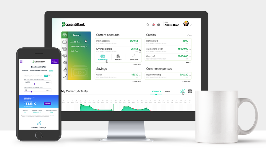
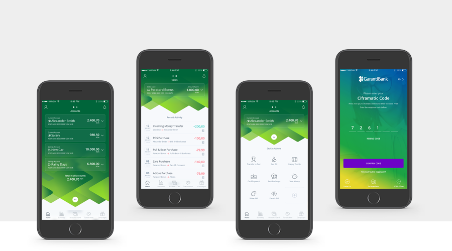
The banking experience
Turning a complex process into an easy and beautiful ride
Role
Involved in all aspects from web app and mobile to atm terminals, my goal was to design a modular system that would allow showing each user only the items available for him at a certain moment in time.
The idea was to make the banking experience simple, enjoyable and fun in order to increase the customers’ involvement, UI and UX wise.
My team and I created the key user personas – corporate, young and middle-aged – and actually talked to some of the existing and potential clients to better understand their needs and preferences. We found they liked nicely designed colored apps, but the key aspect was user-friendliness. And that they had trouble understanding the banking terminology, determining the extra charge of a transaction, or performing some specific tasks (such as split-paying a bill).
The most important KPI was the average amount of time spent to complete a transaction; so we started monitoring that. And the design challenge was integrating the overly complex menu and options.
In order to reach the objective, we made sure the user’s path to completing an action was clear enough: clearly labeled items, added easy-to-understand call-to-actions and plenty of tooltips, made the progress display visible, and skipped as many non-necessary steps as possible.
Another good idea was to animate the menu, while making sure the items stacked behind it were still visible – and it worked. And of course, ensuring the apps, features, and processes are coherent throughout the many devices a user might have.
For the atm terminal, we had special aspects to consider. The most important one was that we were dealing with a Turkish bank operating in Eastern Europe, so we made sure we display everything in the user’s native language, starting right from the greet.
Responsibilities
Research
Wireframing
User Testing
User Experience
Product Design
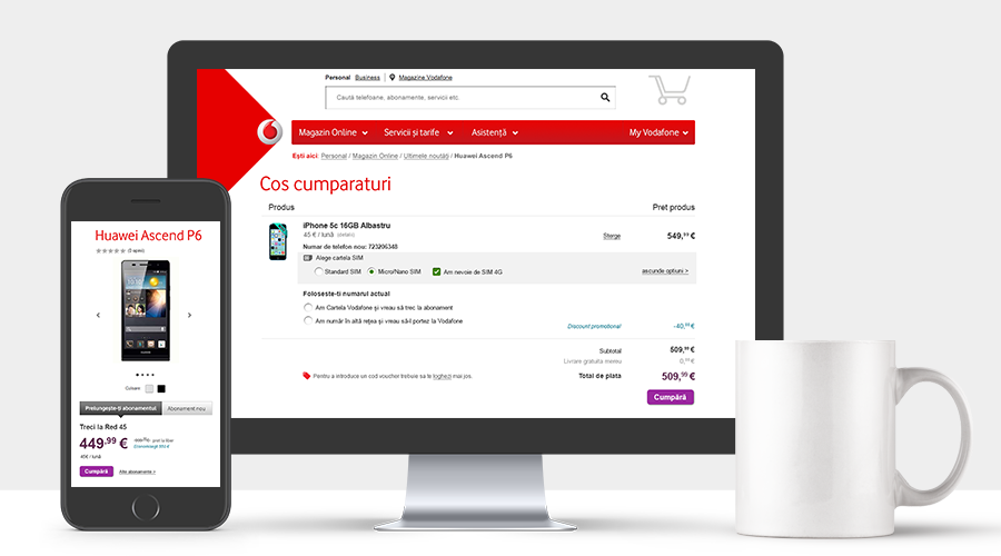
The buying experience
How using prior learnings helped the new product gain traction
Role
I was responsible for the concept and design of the whole checkout process.
The entire buying process was cluttered and had a lot of options. Notifications, validations and hints proved to work.
Pre-check out tax and shipping estimates
Many e-commerce sites lose users at the cart page because they can’t preview their final charges before initiating checkout. In a recent study, 37% reported they abandon carts when this information is presented too late in the checkout process.
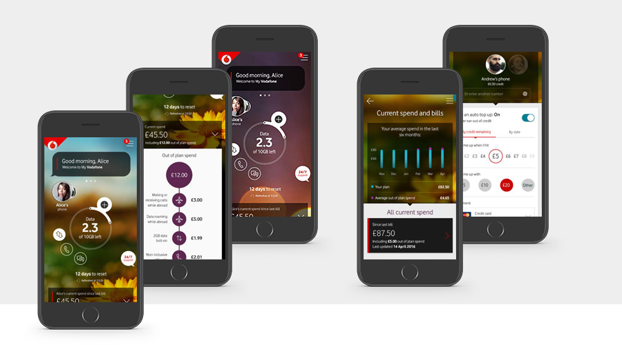
Encourage users to login in order to see personalized offers
Even though in general retail experiences, it’s recommended to give users the option to checkout as guest – for those who forget their password and don’t want to go through the password recovery process – in this particular case, the login was essential for showing personalized offers and discounts, tailored to the user’s profile.
Allow users to take photos of their credit cards to populate information or make sure the input fields are pre-filled with the non-necessary info, like commas, separators, and so on.
Responsibilities
Research
Wireframing
User Testing
User Experience
Product Design
The app experience
How to Create Good Multilingual UX Design
Role
Adapting the Vodafone app to the Romanian market and making sure the assets stay consistent with their new branding, while having a strong attention to detail. Challenge: The product that the international team developed wasn’t keeping the UX design flexible, the design often broke when more languages were added. Also, sometimes out-of-context translations lead to poor user experience that could turn off customers.
Localize design
The goal of localization should be to create a user experience that feels like it has been specifically designed for a language and culture. Ideally, no user should detect that the original product stems from a completely different country and cultural background. First, as a team, we had to start with putting all the main functionalities of the app on paper, focusing on actions and roadmaps the users had to take. In Romania, the buying cycle and options are different from the UK; it also uses different formats for date, time, and measurements when comparing to the US or the UK.
Catch design breaks and optimize your design
I made sure the adaptation in other languages has flawless user experience for multiple languages. As a team, we had to agree on a naming convention, in order to keep consistency, increase customer satisfaction, and reduce the number of customer support calls, consequently saving costs. Working close to the translator and copywriters, I made sure that high translation and adaptability is ensured, avoiding nonsensical wording and translations. It was especially important because there is also color blindness to take into consideration, or those who are visually impaired. Ultimately, a design that can accommodate the extremes had to be built in a flexible manner.
Responsibilities
Research
User Experience
Product Design